
CLICK ON THE PHOTO FOR OUR VIDEO REBRAND REVEAL
You have probably noticed a subtle change to our email signatures and to our real estate yard signs – a new logo! Coldwell Banker recently rebranded from their signature mark, a brand that lasted 113 years! It is a brand that everyone knows and trusts, and we are also a part of a brand that continually pushes the envelope, pioneers new ideas, consistently innovates and creates, and is cutting edge, yet the logo with the blue box did not represent who we are now as a brand and where we are heading.
“This rebrand for Coldwell Banker could not have happened at a more opportune time to align with the changes and growth we are seeing with our local office at Coldwell Banker St. Croix Realty. Two years ago one of the most successful franchises, Coldwell Banker Schmidt Family of Companies, purchased our company adding tremendous value, tools and support to take us to the next level. I was then hired a year later to facilitate our growth and with doing so our company acquired new agents who came with new ideas and skills. The rebrand perfectly represents the changes within our local office – combining new with traditional! I love seeing seasoned agents help new agents grow and new agents teach our seasoned agents new skills.“ – Bry Locher, Managing Broker Coldwell Banker St. Croix Realty
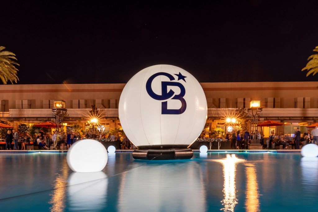
Our rebrand: Project North Star was born from the idea that our agents have served as guides to Buyers and Sellers for 113 years and that our company has consistently set the bar and led the way for our industry. The North Star symbolizes the guiding force that is the Coldwell Banker network.
Tracy Bacigalupi President of Marketing for the Schmidt Family of Companies shared with us her thoughts on our rebrand.
“Our new brand is fresh and modern and better represents the truly innovative brokerage firm that we are. That for over a century, Coldwell Banker has stood for something unique in the world of real estate. We’ve kept our signature blue color, while revising our bounding rectangle to a sleeker, more compact square – a profile more in keeping with today’s mobile-first culture. All of the elements of our rebrand unite to create a symbol that represents the essence of what Coldwell Banker is today, and where we are headed tomorrow.
The CB North Star mark features a visual icon that sets us apart – a star. This star represents two distinctive elements that exemplify the Coldwell Banker brand. First, the five-pointed star is a recognized mark of excellence, one that symbolizes the quality of service that we’ve provided since 1906. Second, throughout history the North Star has been the beacon that explorers have used to guide them to the place they most cherished – home. Sitting confidently above the CB, this North Star signifies the fact that we’ve been guiding people home for over a century, longer than any other real estate brand.“
Let us be your north star and guide you to your home sweet home (or vacation home) on St. Croix!

Recent Comments